Sean Bosworth
Interior Design Studio and Residence
Selma, CA
CONCEPT -
MY CONCEPT FOR THIS DESIGN IS TO KEEP THE FLOOR PLAN OPEN AND ALLOW NATURE TO SPILL INTO THE INTERIOR SPACES. MINIMAL CIRCULATION SPACE AND FULL HEIGHT INTERIOR GLASS WINDOWS PULL THE SPACES TOGETHER WHILE MAINTAINING REASONABLE AMOUNTS OF SEPARATION. INDOOR GARDENS AND AMPLE SUNLIGHT PERMEATING THE STRUCTURE THROUGH SKYLIGHTS AND SOLATUBES ENSURE THAT INHABITANTS AND EMPLOYEES WILL FEEL MORE CONNECTED TO THE NATURAL ENVIRONMENT.
---
Write here...
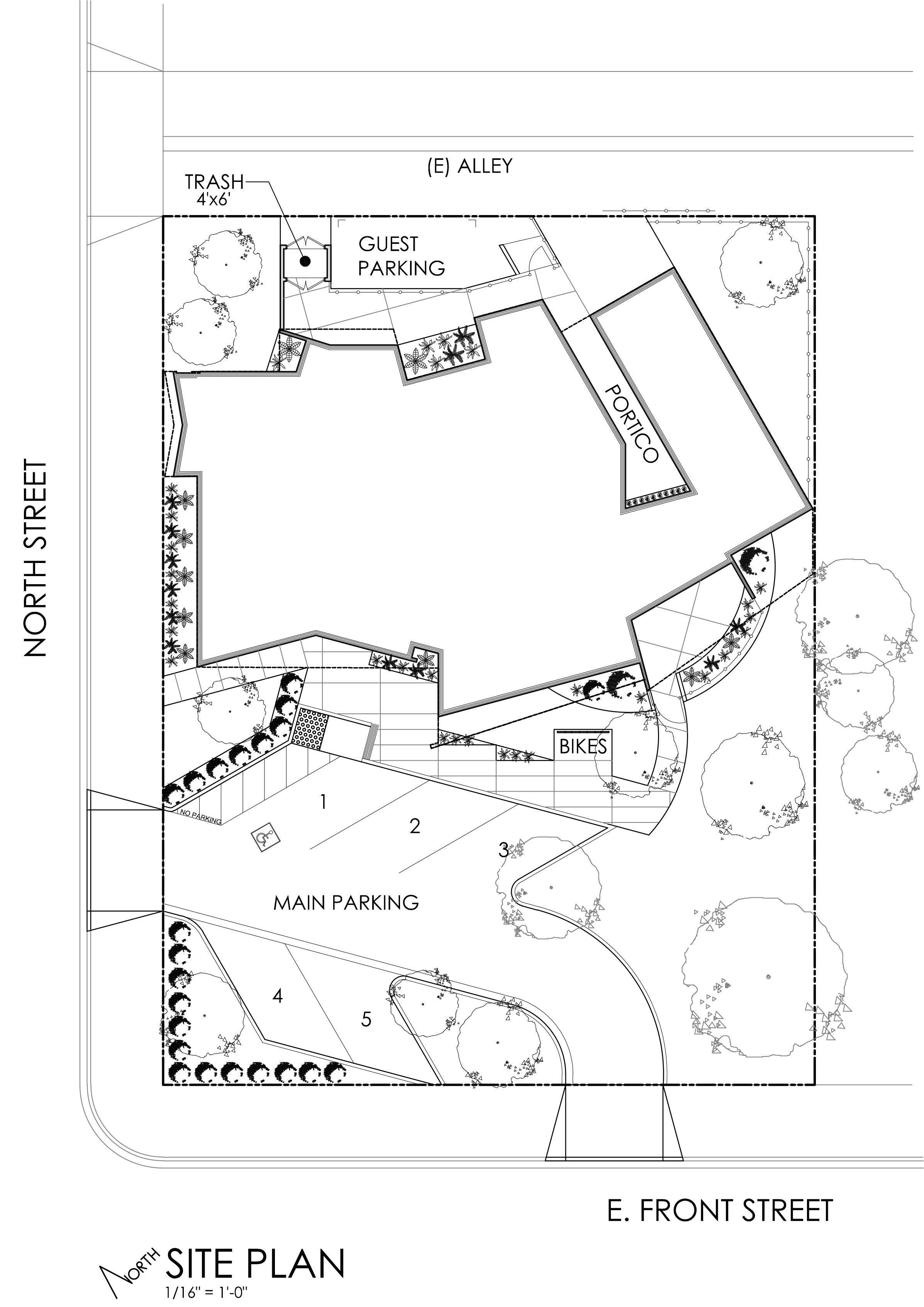
The Site Plan:
Keeping in mind that the site is situated 1000 feet to the Northeast of an active railroad, I chose to place the building to the Northeast side of the lot where it would be furthest from the tracks. This gave me the opportunity to shield the building from excessive noise by placing ample amounts of trees between the street and tracks to the Southwest. The placement of the building also allowed me to create a rear entry from the existing alley for the owner and his guests, while maintaining enough space in the front to accommodate a 5 vehicle lot.
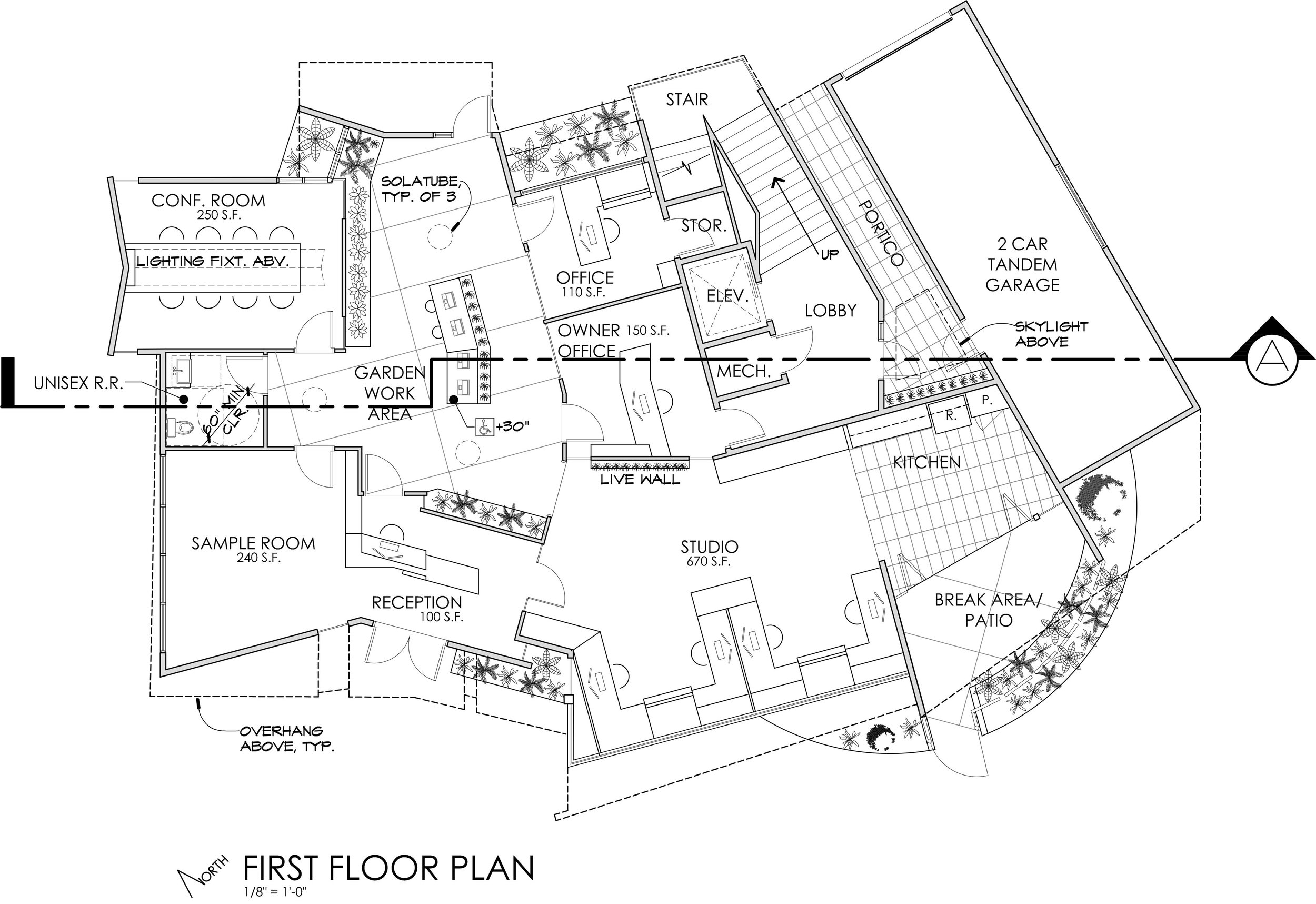
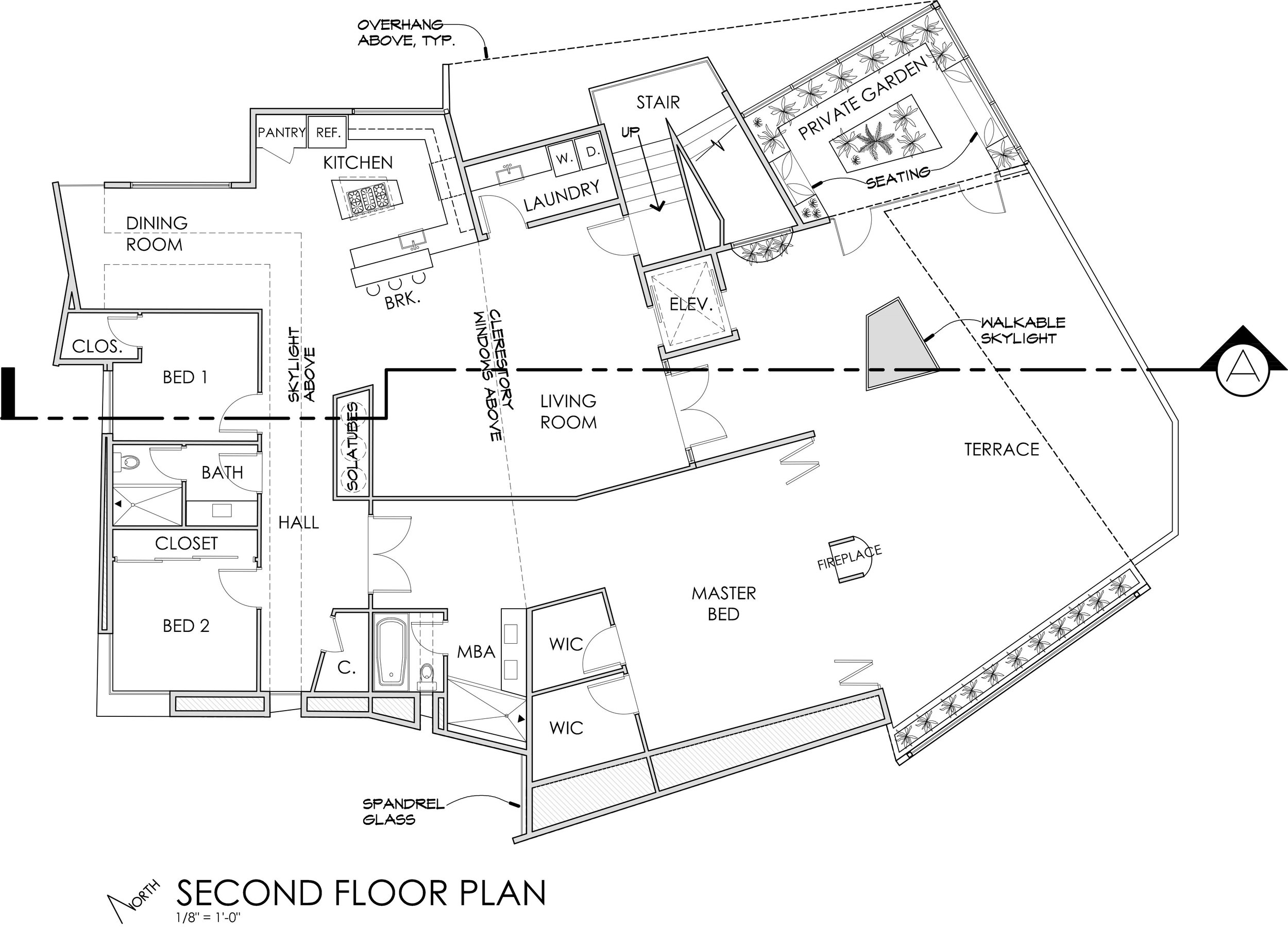
The Floor Plans:
The Program for this project called for private garden areas and a live wall in the studio area, which led me to believe that the owner liked being surrounded by natural elements. Knowing also that employees are typically happier when surrounded by natural light and vegetation, I chose to implement both into the interior spaces. On the first floor, natural light is provided to every room through Solatubes and storefront windows. In areas where the rooms are not at the exterior walls, full height frameless glass allows natural light to enter after passing through adjacent rooms. On the second floor, a skylight runs down the length of the Hallway and makes a 90 degree turn and proceeds over the Dining Room. Also on the second floor, the master bedroom is opened up to the exterior terrace by using a foldable glass Nana Wall. I also wanted to keep the floor plan as open as possible and minimize circulation space. This problem is solved on the bottom floor by creating an alternative work area, characterized by its openness and interior vegetation. moving to the second floor, one hallway exists mainly for separation of the bedrooms and restroom from the great room. Overall, my intent for this layout was to make living and working easy and comfortable for the occupants.
The Massing Studies:
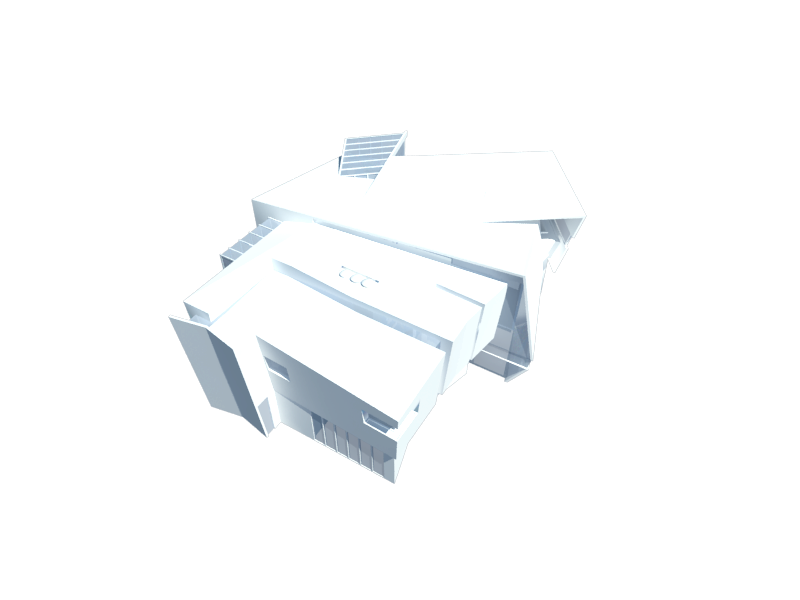
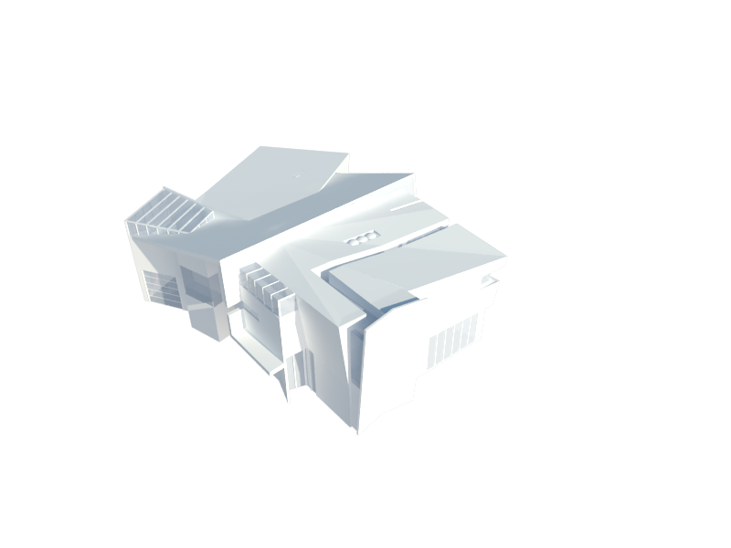
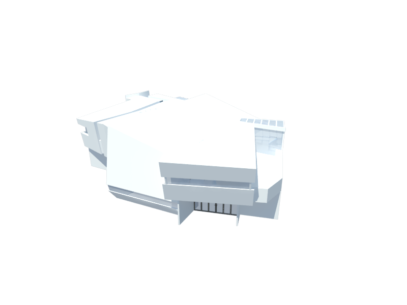
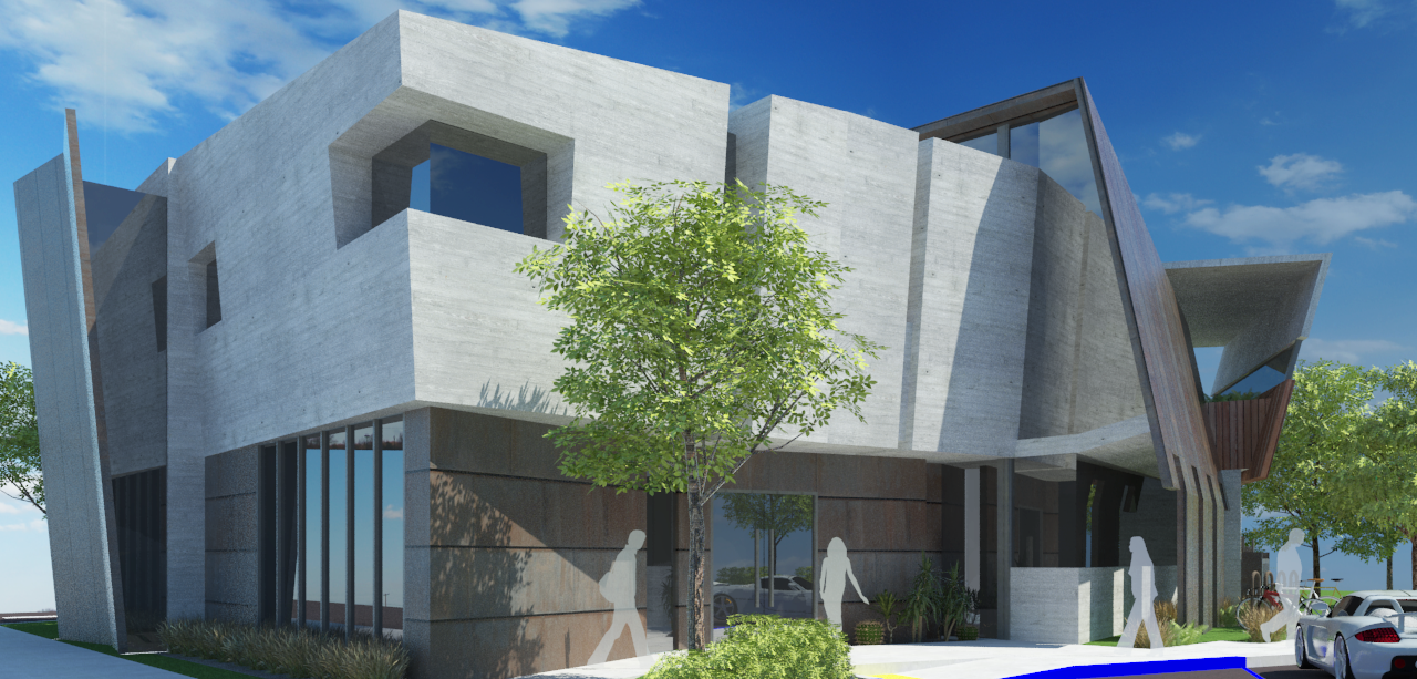
These massing studies are different angles of a quick SketchUp model, rendered with Vray to get an idea of form and shadow. I needed to make sure the windowed areas at the southwest were adequately shaded to provide indirect diffuse light to the interior, and this model allowed me to visualize that. This study model is subsequent to previous models and overlaid sketches that allowed me to realize something close to my final design.
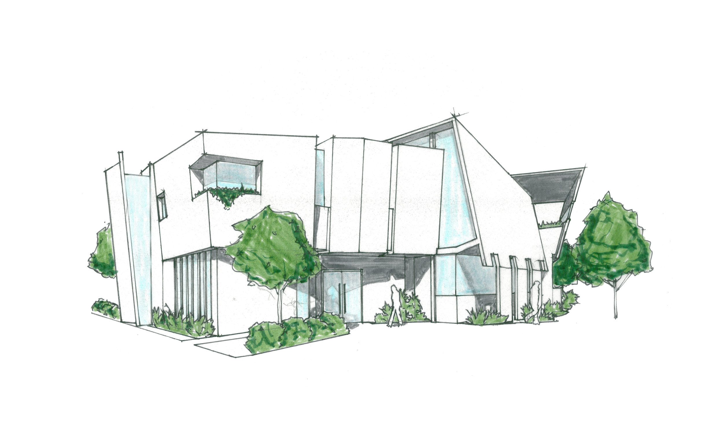
The Final Sketch:
This sketch is where the form of the building was nailed down. The only major deviation from the massing study model was the facade at the exterior of the Studio space. In order to break up the large mass, and create a more planar interpretation of that wall, I dropped down four "columns". What that did was shield the window at the Southwest wall from direct light, while also providing a recognizable form akin to Ancient Greek colonnades.
The Section:
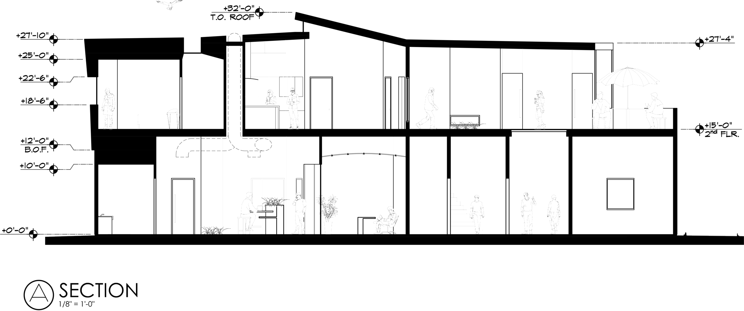
I chose to cut the section in an area where it would really show the openness of the building. As we look at the Garden Work Area we can see the ceiling height is approaching 15', which opens the space even further and provides space for the routing of mechanical ducts and Solatubes. Another reason for the section being cut in this location is to display the areas that light has an opportunity to enter the building and move through to different spaces.
Front Elevation:
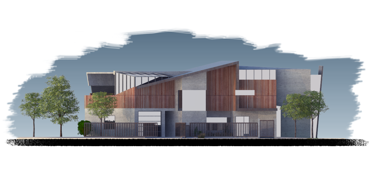
The roof line is intended to complement a specific portion of the floor plan. When looking at the second story floor plan you begin to pick up a sort of stepped curve at the southwest exterior wall. The form for the roofline was generated by mirroring that stepped curve and sketching out possibilities for pulling the design into 3 dimensions. I eventually decided to create the primary contour by implementing planes that hovered over each other and continued down the walls of the second tory. I decided to balance the very planar structure to the right with a large mass on the left.
Rear Elevation:
In the beginning of the design, the rear elevation was very tall and imposing. To break up the very tall surfaces, I dropped a plane down vertically from the roof and had it transform into an overhang for the door that leads into the Garden Work Area. There is also a large window to fragment the exterior wall of the stairwell - a surface that would have been very tall and plain otherwise.


